The right game on every screen
A small box on the network changes the channels itself. Set the venue's sports preferences once and the right game is always on, without anyone reaching for a remote.
Feed analysis · Interactive prototypes · UX writing · Design system · React Native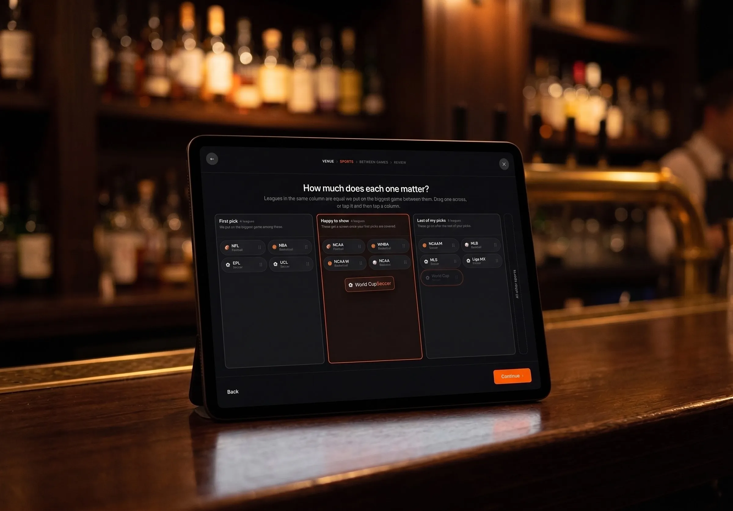
Rebuilt setup on the live feed
The product changes every channel over the network, so the right game is always on and nobody goes looking for it. All of that rests on one thing: the venue telling it what it cares about.
That was the part failing. So I rebuilt the setup as a clickable prototype running on the live feed. The client signed off on the working thing, not a picture of it.
A wrong answer nobody could catch
A bar manager knows which TV package the building carries about as well as they know their phone plan by name. The worse problem is what a guess does.
A receiver reports a channel the venue does not pay for as though it were fine. Nothing catches it, and the schedule fills with games that land on a subscription screen.
This was not hypothetical. It had already happened at a real venue.
I was asked to shorten the list of packages. I removed the question altogether.
Probe the TV, don't ask the bar
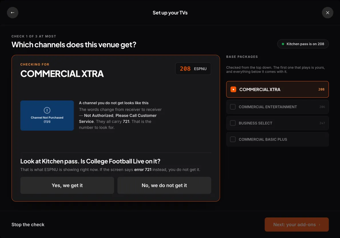
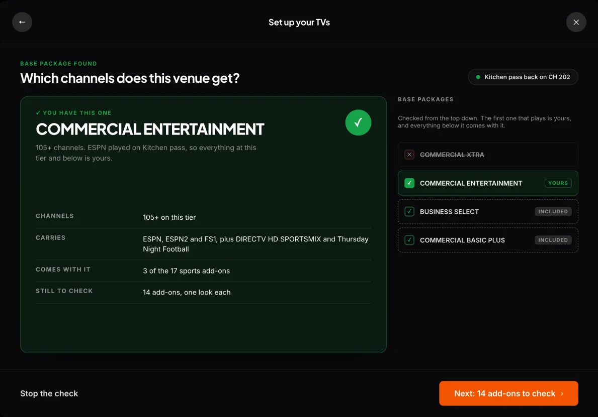
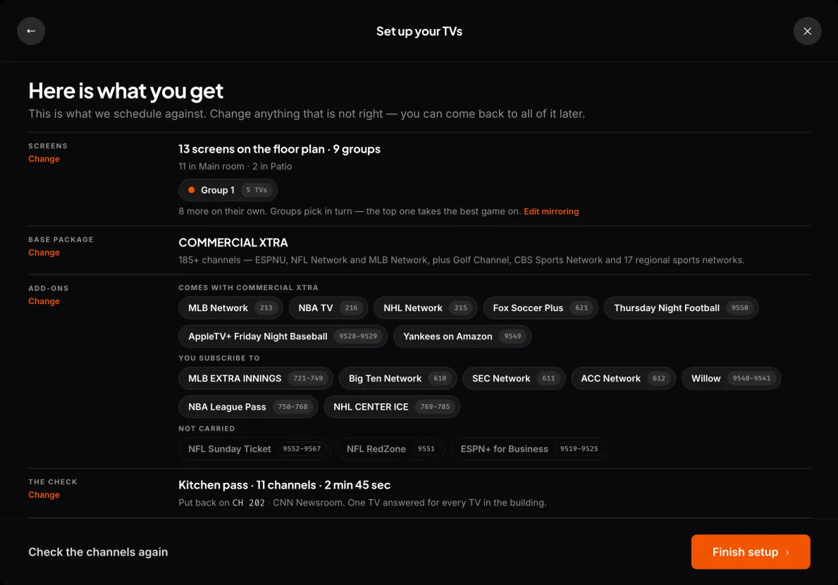
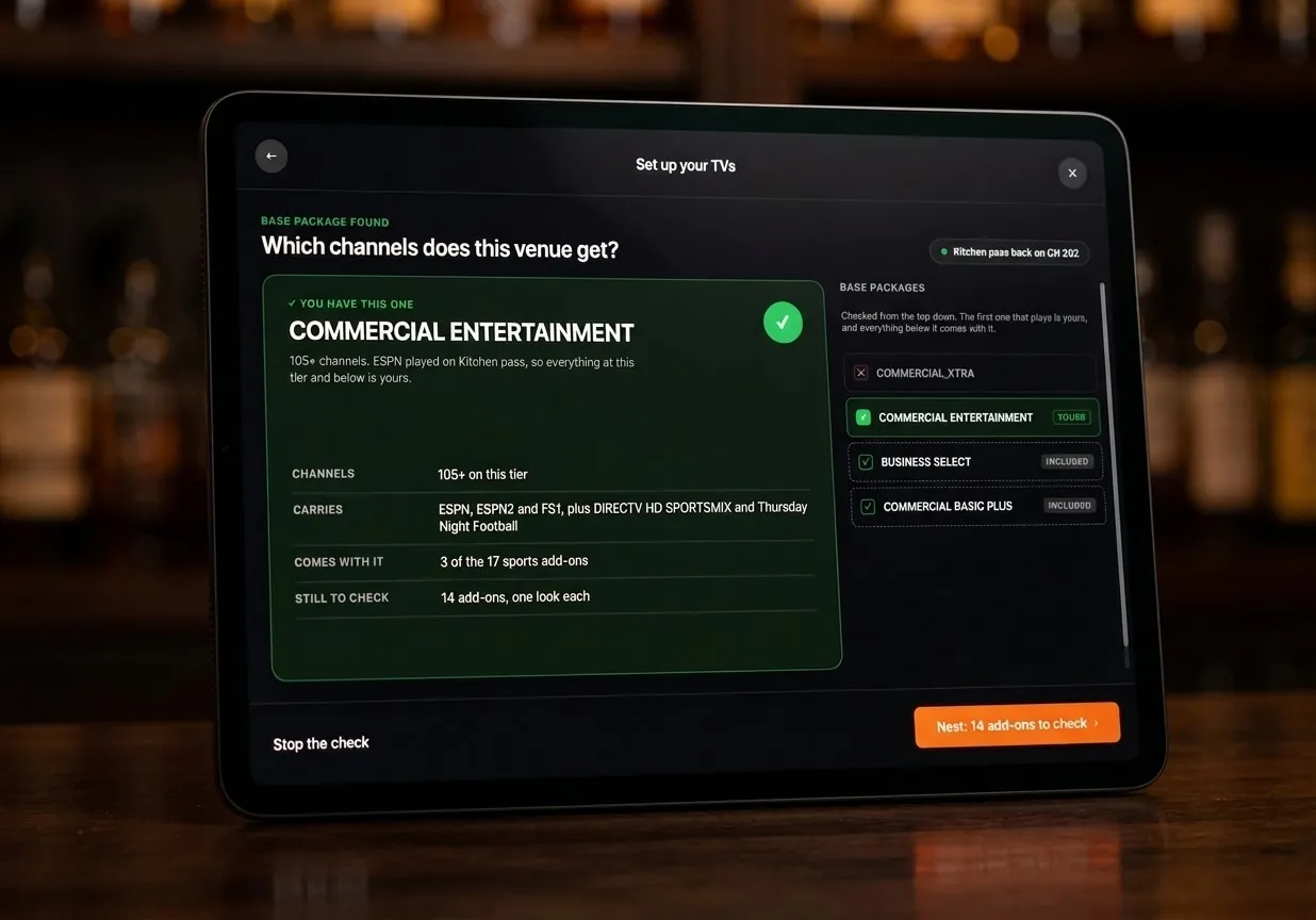
What answers the question now is a probe the technician runs on site, once the floor plan is built. They pick a TV off the plan they have just drawn and walk to it.
The receiver will not admit a channel is missing, and nothing about that failure reaches the API. What it does instead is put the same error number on a subscription screen every time. The probe shows the technician that number and asks them to read back what they see. The tiers stack, so it is three checks at most and often one.
The bar already had a tablet
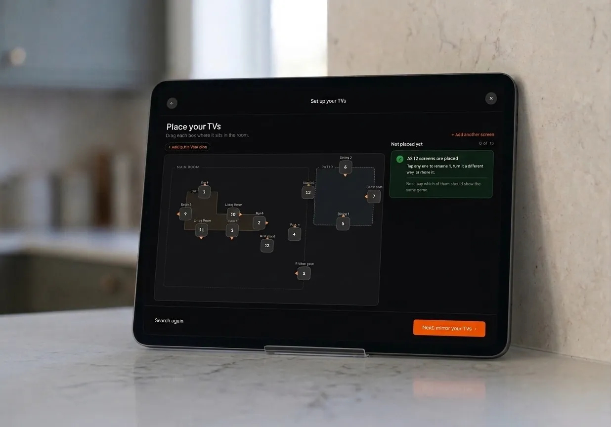
The first install answered a question nobody had asked. Both venues already ran everything off one shared tablet behind the counter: table availability, the HVAC, and the TVs. One of them drove its screens from a wall system with its own iPad front end. Nobody was going to keep two tablets behind a bar, so the product had to absorb the one already there.
One object, two moments
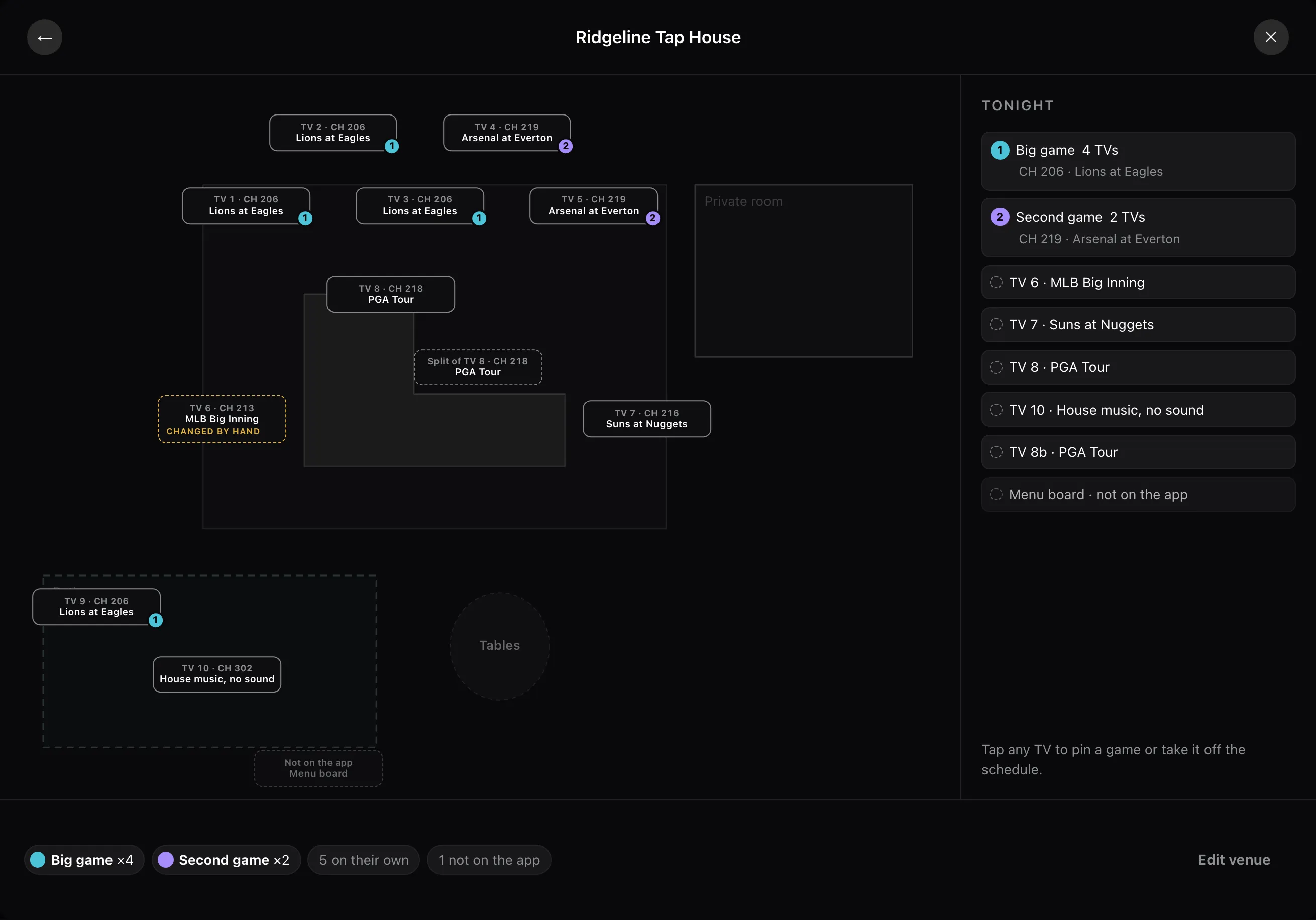
The map a venue builds during setup is the screen its staff use every night. I designed the nightly view first and the builder second. The old one showed where each TV was and nothing about what was on it.
A TV sits in exactly one room but can belong to several groups. A room is drawn as an area on the map and a group is a colored badge on the TV itself.
Asked for sports, listed leagues
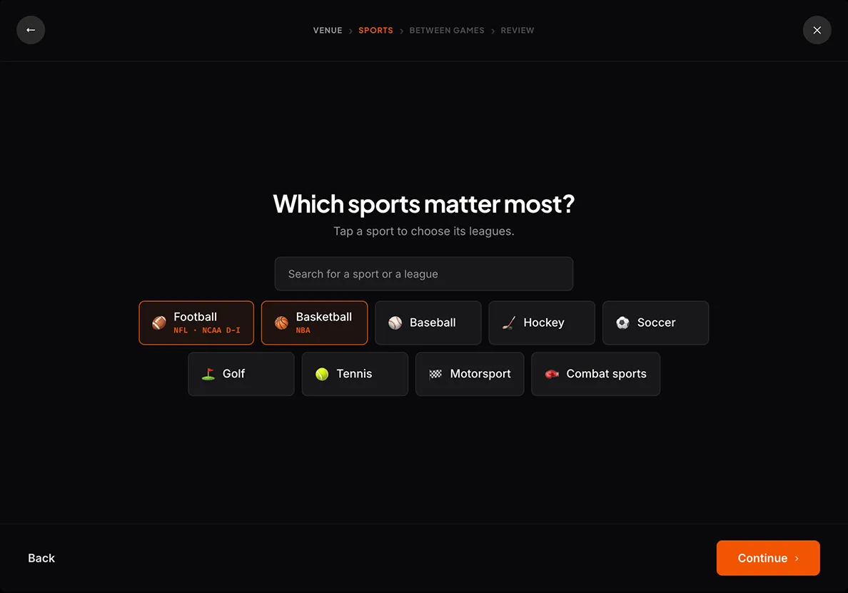
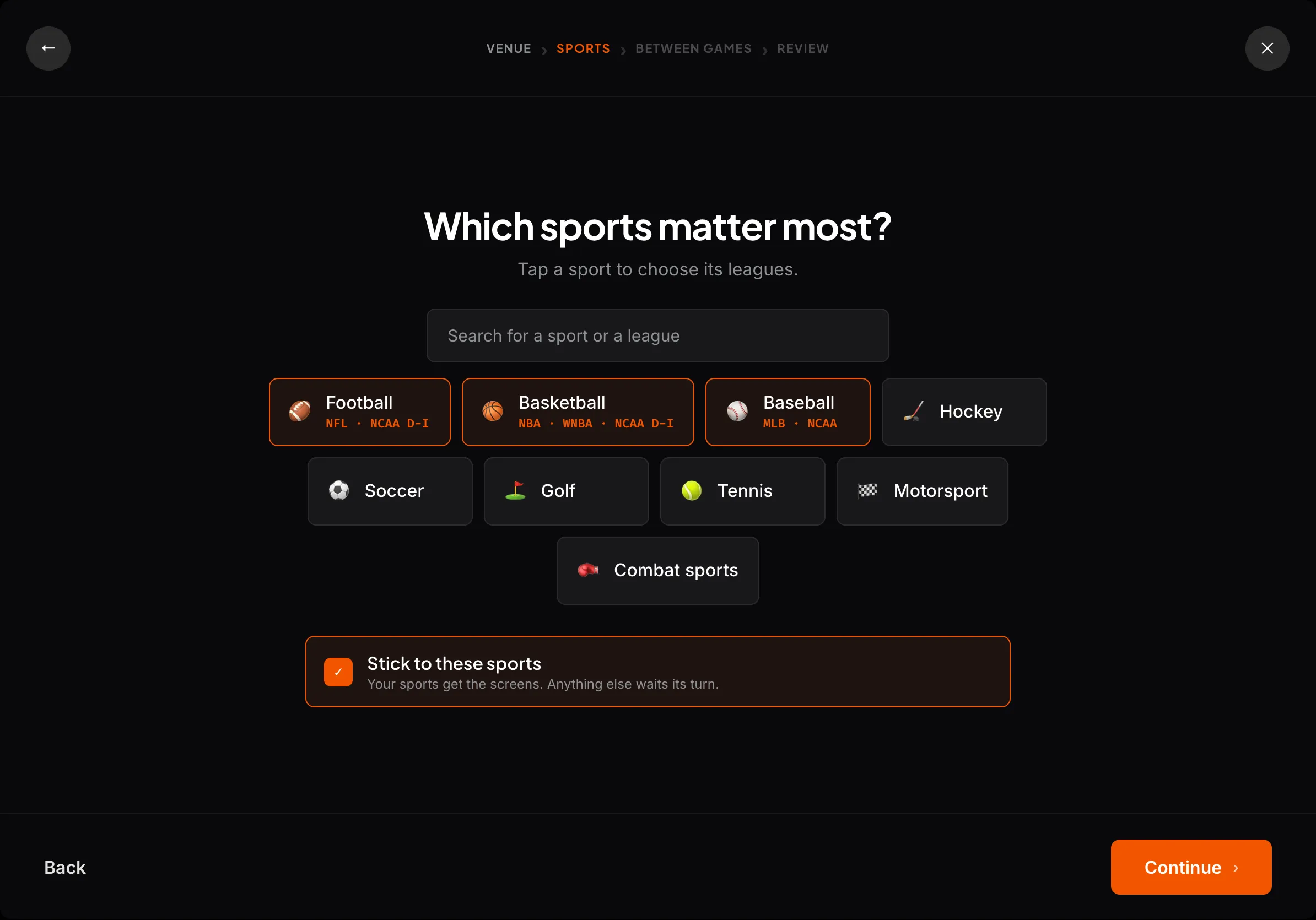
The old screen asked which sports a venue’s customers enjoy, then offered NFL, NCAA Football, NBA and NCAA Basketball. Those are leagues, not sports, and the distinction is not pedantic: a bar across the road from a college wants the college game. So I split sports into two levels, with their leagues one tap behind.
Grouped so a search returns one row
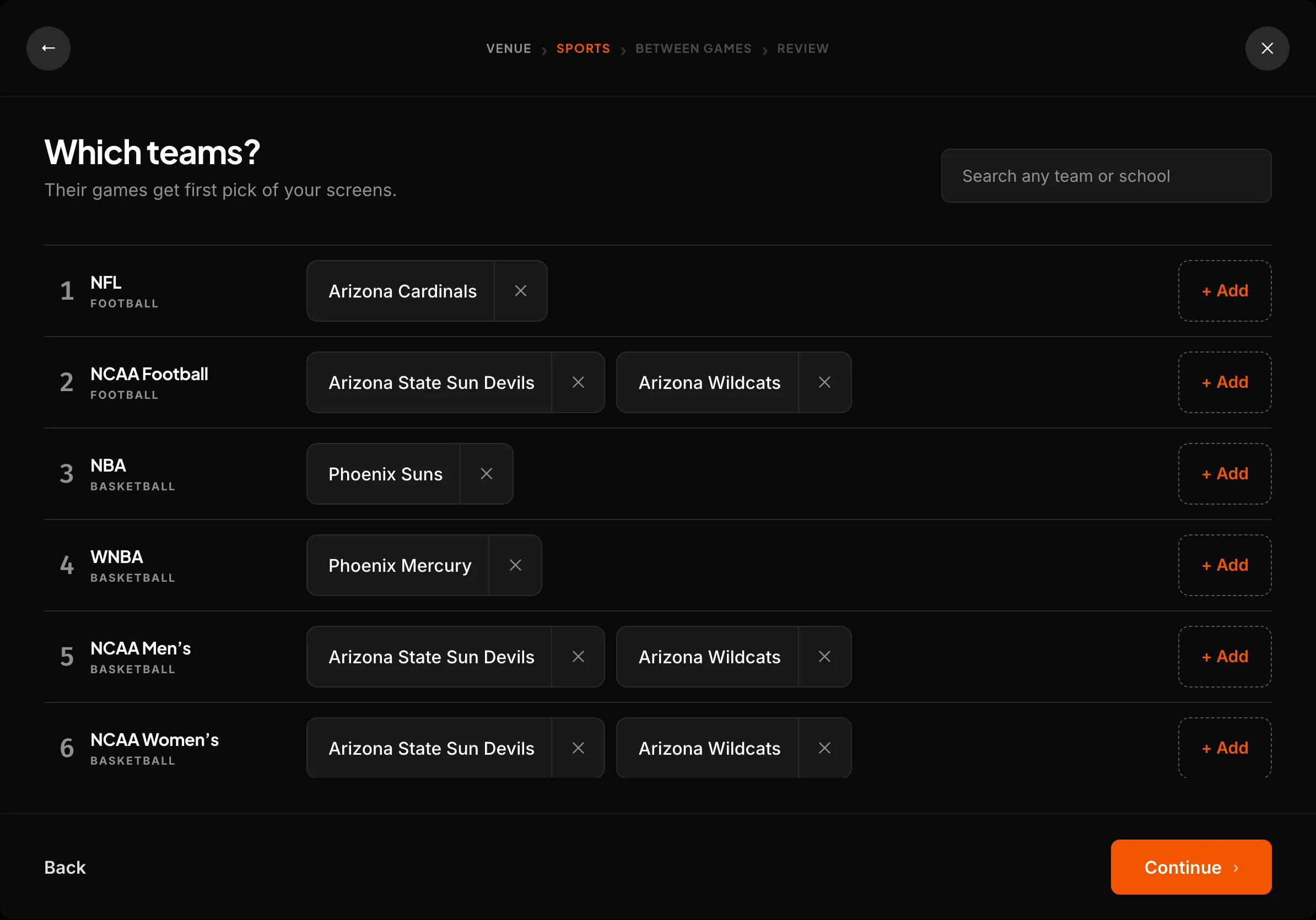
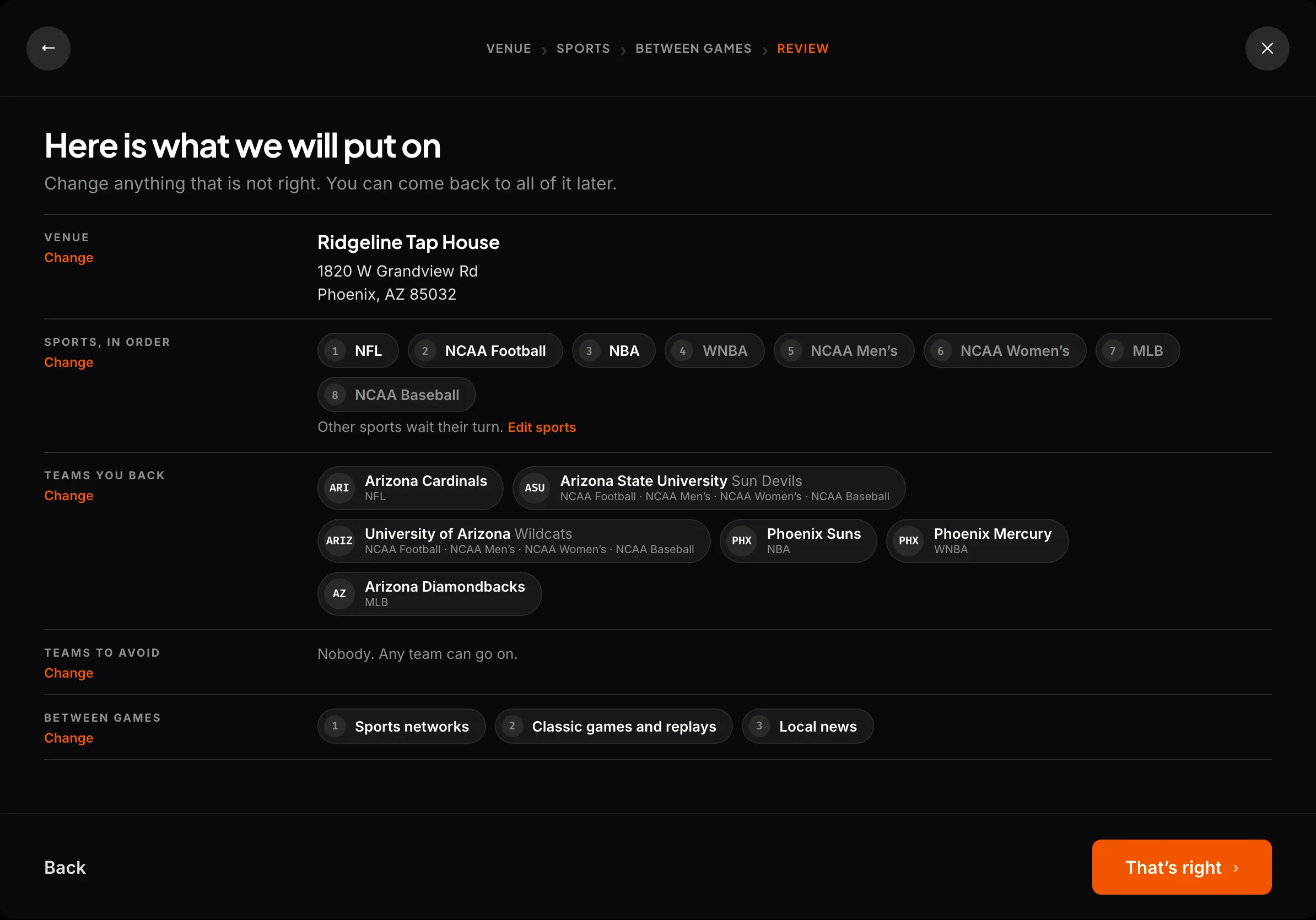
Tapping a sport opens the leagues inside it, and each sport reads back which of its leagues are on. A venue can check its answer without opening anything. I grouped teams under the league they play in: a search for one city was returning four rows that read the same. The last screen plays the whole thing back in plain sentences.
Prototyped on the real data
The old team screen offered three guesses based on the venue’s city. I went and got the real list: 38,266 teams, pulled from the licensed feed the product already runs on. Of those, 5,584 looked like duplicates. They were a men’s and a women’s team sharing a name. I labeled them. Merging would have collapsed two real teams into one row.
I stopped asking for what the product knew
Two more screens went for their own reasons. I cut the venue type because I checked what read it downstream and nothing did, while the screen itself claimed to shape the programming.
A promise the product does not keep is worse than no question. The location screen went for a plainer reason: the address was already typed at checkout. The product keeps that answer and stops asking for it.
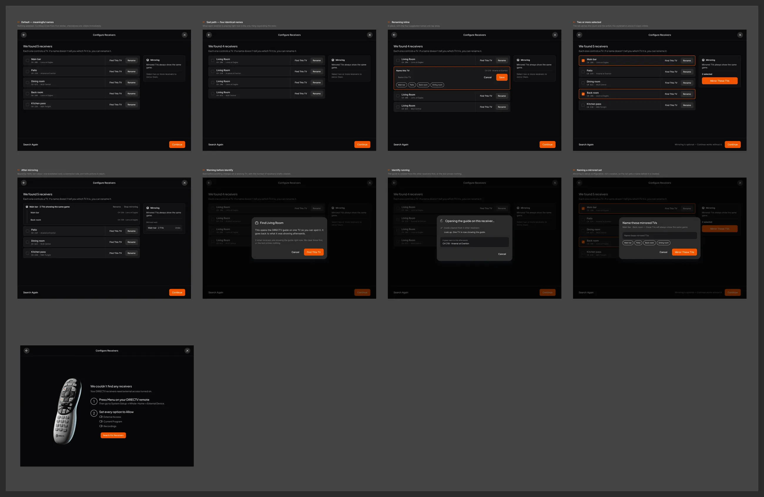
Ported the screens back into Figma
That was the venue’s half of the problem. The other half was handing it over.
I built the prototype out of the library’s own components. A prototype the client can click is worth little once it reaches the codebase if the design system does not know about it. I found 23 of the 35 components those screens needed already existed. A silent match is how a library drifts, so the tool proposed each swap for review rather than applying it.
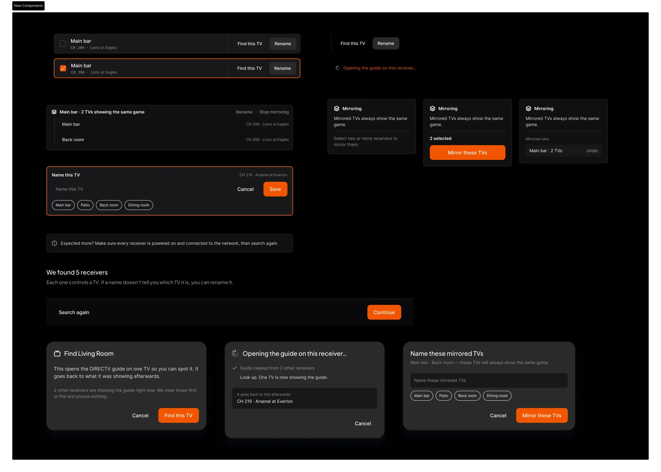
Built the twelve that didn't exist
The other twelve I built, using Claude and the Figma MCP bridge to do it: auto layout throughout, and every one of the 69 text layers on a shared text style. 225 bindings to the design system’s own color, type and spacing variables, every one matched without a manual fix.
Three of them are component sets, so the nine states of one screen are drawn once and pulled in wherever the flow needs them.
I left the venue less to answer
Five screens are gone from the buyer’s flow. Three of them were the whole Cable section, two of those asking a bar manager what no bar manager knows, and a probe answers that now instead of a person. The last two asked for something the product already had or never used. Teams to wade through fell 3,401 to 1,927, once the leagues a venue picked did the filtering.
These count the pool the design exposes, not shipped behavior, since the engagement is active. The interface got simpler because I understood the system underneath it.
I authored the seven clickable prototypes, pulled and analysed the Gracenote feed that drives them, and wrote the flow, the copy and the component register. I ported the new screens back into Figma and rebuilt the twelve components that had no equivalent there. I wrote shipped React Native components for the tablet app, and I helped build the Figma to React Native sync skill Very uses to keep the two in step.