Air, water and scent. One unified app.
Three machines sit in a house: one cleans the air, one filters the water, one scents the room. This app runs all three from one screen, for the people who own more than one of them.
Competitive research · Interface design · Design system · React Native · Figma sync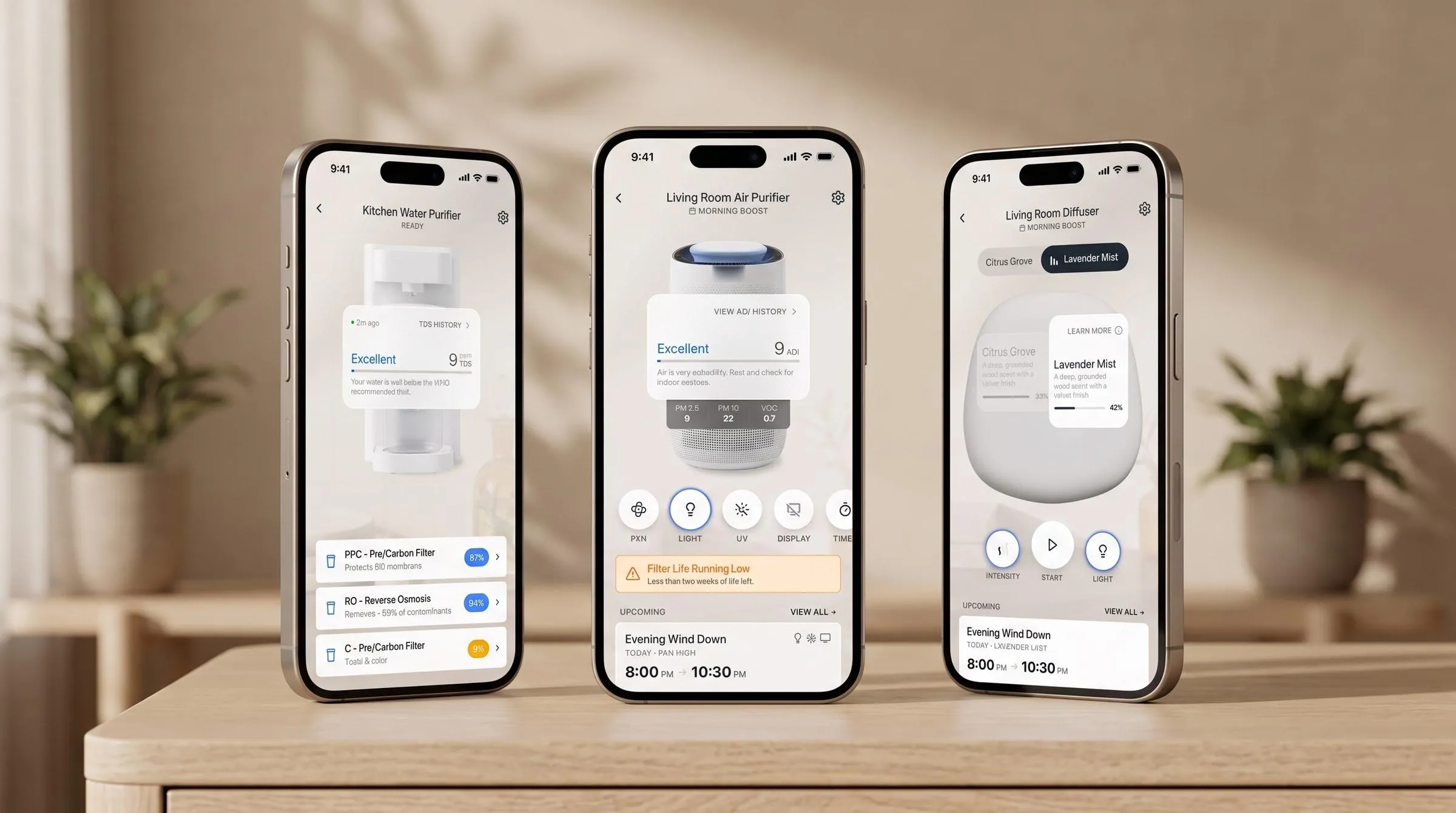
Two devices sold, one new, none connected.
The air purifier and the water purifier were already in people’s homes, run from the buttons on the front. The diffuser was new hardware, still being tooled. The company wanted one app for all three.
Nobody had done it. Of the eleven competitor apps I went through, not one ran more than a single kind of device.
Bluetooth gets it onto the Wi-Fi
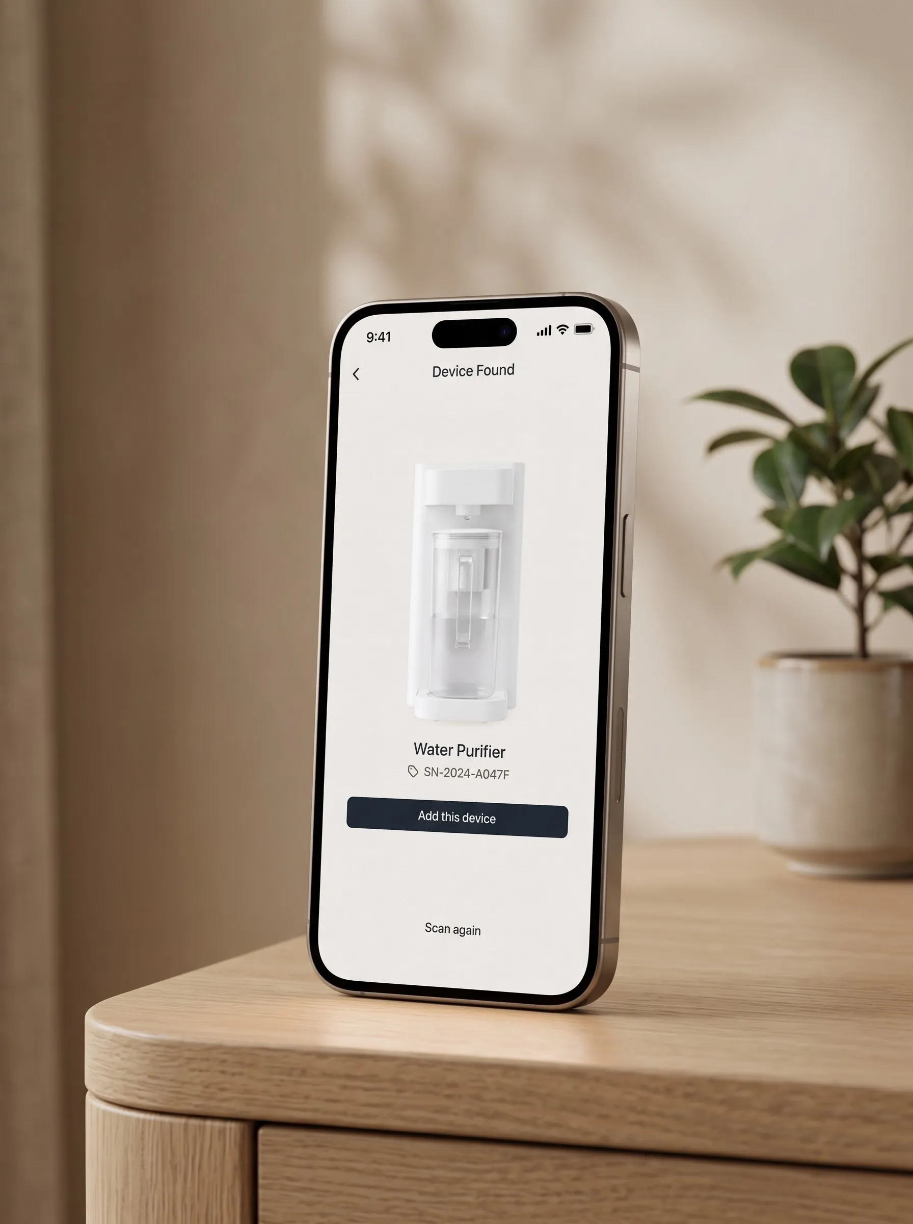
A new device cannot join a home network on its own. The phone finds it over Bluetooth first and hands the credentials across.
I gave all three devices the same six steps and the same screens, because somebody who buys a second one should not have to learn setup twice. The room you pick names the device, and the network you used last time is already filled in. The second device is faster than the first.
Ordered by how often a thumb reaches for it. The next control they add already has a home.
Every control in one row
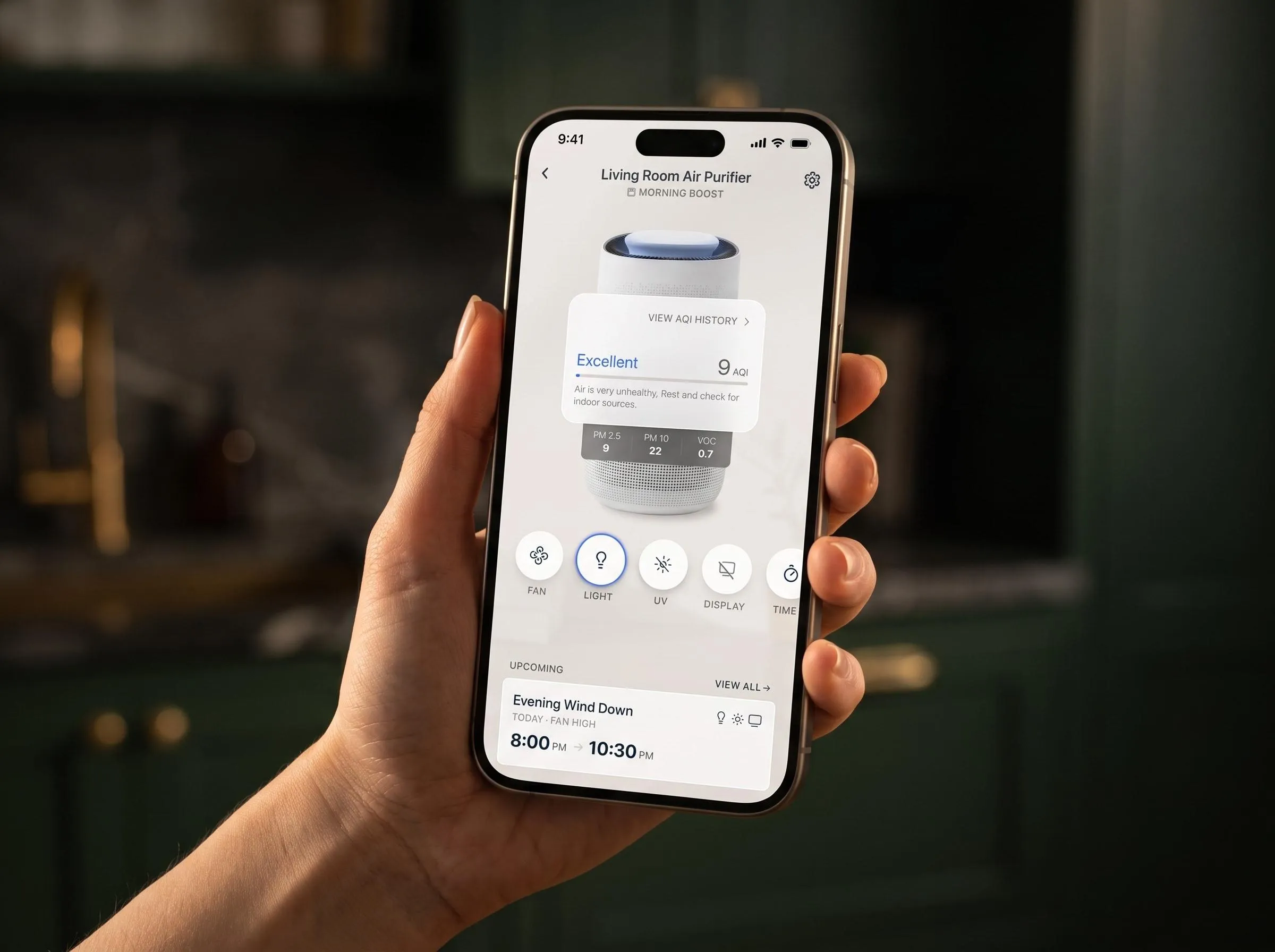
Fan, light, UV, display, timer. The list was still growing, and every new control wanted a home that would still make sense once the next one arrived.
Splitting them across two places lost early. Everything went in a single row, ordered by how often a control gets reached for, not by what it does. The rare ones sit farthest right, and the next one added joins the end. The same row runs on all three devices, which is what keeps a second machine from being a second thing to learn.
I built the options as working screens with Claude Code and tried each one with a thumb.
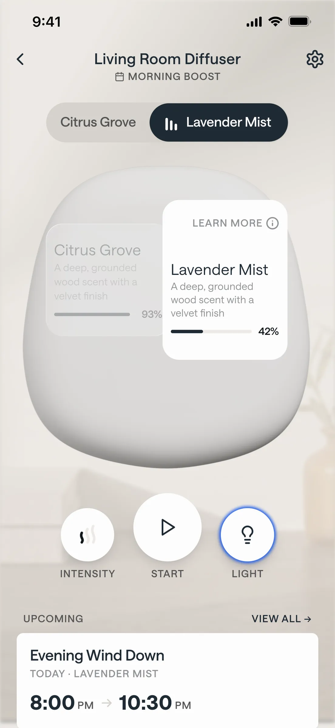
Kept the busiest screen quiet
The diffuser holds two pods, and one screen has to carry what is in each, which is running, how much is left and what runs next.
Switching should not cost you sight of the other pod, so the toggle picks the chamber you are acting on and leaves the other in view. Intensity, light and the next scheduled run sit under the device, in reach without crowding it.
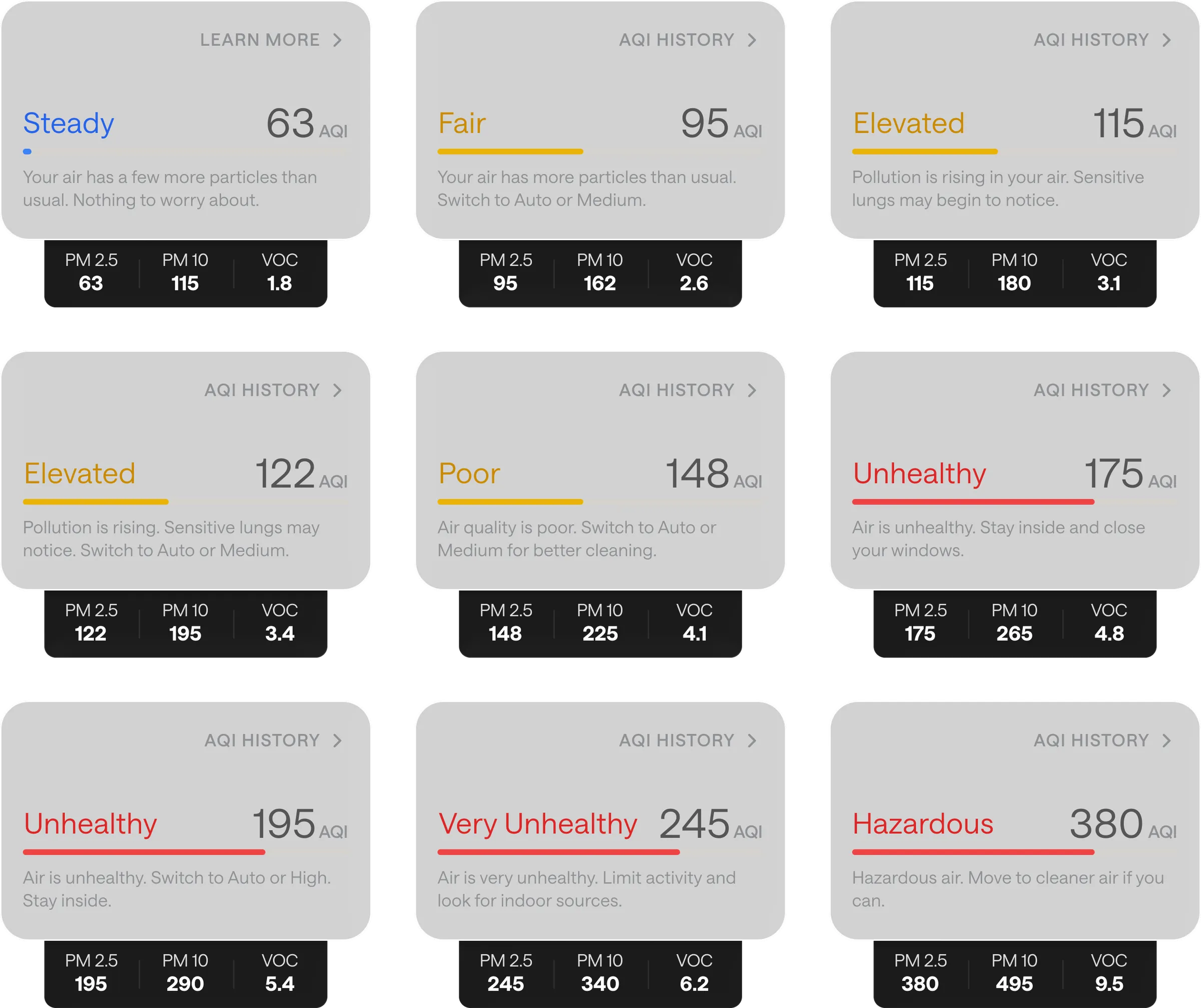
Made the number say what to do
Every one of the eleven competitor apps showed a particle count and left the reader to work out whether it was bad.
So I wrote the scale myself. Fifteen states, each pairing a band, a number and one sentence, with the raw readings tucked underneath.
I used AI to widen the field, not decide it
AI moved the work from producing to choosing. I generated directions in bulk, then built the promising ones as screens I could run with a thumb. I was picking between things that existed rather than defending the one I happened to draw.
That is how the air-quality chart got settled: coloring the line at each threshold beat banding the background, and I only knew because I could hold both. It wrote components with me and checked all thirty-four against their Figma source. It never made the call.
I built and shipped the UI animation package
This is running, not a recording. I ported the app’s empty state from the React Native component I wrote into CSS, on the same paths and the same draw.
Each device holds 2800ms, then hands over: the outgoing icon retracts along its own path as the next draws in. They overlap in the middle fifth, so it reads as one line redrawing itself. On an empty screen, that line is the whole product: one app, three machines.
The second machine is the test
Three machines, one set of screens: the same six steps to add any of them, the same row of controls once they are in, and one scale that says what the air in the house is actually doing.
The engagement is active, so there is no shipped usage to point at. What the design is built to earn is the second purchase, and that is what to judge it on. An owner who already has one of these machines should find the next one familiar before they finish unboxing it.
Sole designer. I ran the competitive research, bought and operated nine competitor devices, and wrote the analysis that set the product's direction. I designed onboarding, the home screen, device detail, schedules and settings for all three devices, and authored the Figma library behind them. I wrote shipped React Native for the app: design system components, several screens, and three animated components. I extended the Figma to code sync tooling.